asMany seem to see brands as pillars of a modern world, the icons of a corporate system that underpins the very bedrock of Western life.
Wherever we look, we are bound to receive a face full of logos, and one thing is for sure; many get it so wrong.
It is a practice that I’ll call, brand-wrecking.
So what is brand-wrecking?
Think of it like this. A company logo that has seen many years of competitive markets is your shop of fine china.
It looks fantastic, has value and providing the door is kept firmly shut, it is safe as houses.
However, every now and then, the bull in the form of an over-zealous brand agency armed to the teeth with audience data and market trends, is set loose and the precious china gets swept up in the aftermath.
A tube of superglue may patch things up for a while, but the cracks will always remain. Anyhow, enough of the metaphors.
A modern classic emerged on bookshelves everywhere in 2009 courtesy of authors Jon Edge and Andy Milligan with their publishers Prentice Hall.
The content is king, delivering a wealth of knowledge and expertise to fellow marketers and business people alike.
However, it is the title that gave it prominence, a golden rule for all designers, branding experts and marketing professionals.
In not so many words, repeat the mantra; Don’t **** with the logo.
The message could not be any clearer.
The logo or brand marque is the face of the business, so do not disturb a well regarded one unless absolutely necessary.
While ‘brand evolution’ can be beneficial (good examples include Shell and Starbucks), changing a brand identity can be risky and should be thoroughly thought through.
So why do brands, even successful ones, completely change their logos?
Perhaps it is the advice of gung-ho design firms or a knee-jerk reaction to markets and competitors.
What cannot be ignored is changing to suit a current trend or style, like haircuts and T-shirts, trends soon go out of fashion, so it’s best to ensure you have a timeless marque rather than something that will need an expensive update a few years down the line.
1) Hedkandi

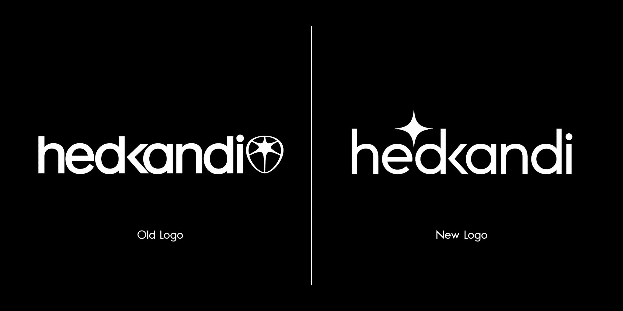
A recent rebrand criticised by members of the public is the new typographic logo design for clubbing brand Hedkandi.
Since its conception, the brand name has become synonymous with its iconic star symbol developed by Mark Doyle and the illustrative artwork created by Jason Brooks.
The universally recognised rising star has undergone some development since its humble beginnings, but its pairing with timeless typography was a marriage made in design heaven.
Symbolically, the symbol represents the brand that rose above the rest to become a ‘shining example’.
A star, is in itself, a pinnacle symbol.
The last evolution of the marque could get interpreted as Polaris, the star in Ursa Minor which had become a beacon for sailors and travellers throughout the ages, aiding their navigation.
Metaphorically, the Hed Kandi symbol could represent the enlightenment in the dark of night, showing the way to their followers as a market leader.
Either way of decoding the symbol, it helped give Hed Kandi a leading market position.

Although recent years have indicated that the brand has been moving away from its icon, the latest has been a far cry from the beloved symbol we’ve come to know and love.
I must point out it is unclear at this stage if this is a full rebrand or a pilot as no statement w made by Hedkandi or its parent company Ministry of Sound.
However, the new identity has been applied across most touch-points, including the official website, digital releases and event advertisements.
The new-look has favoured a stencilled logotype.
As expected, the new design has been received with criticism.

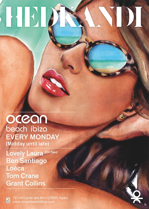
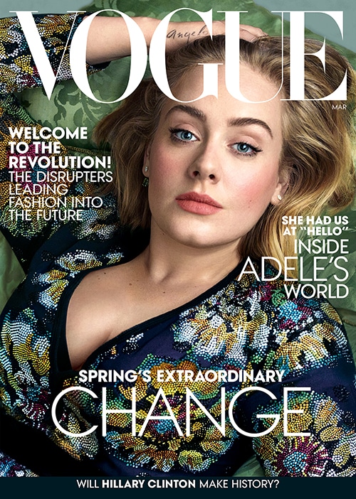
It is almost reminiscent of classic Vogue magazines; perhaps this is a move made as the brand becomes more fashion and lifestyle focused.
Though not quite the same, perhaps it’s a little too close for comfort.
Overall, the typeface simply does not suit the music, and fun-loving glamorous personality HedKandi has become renowned for.
The type feels restrictive and rigid and will no doubt need updating in a few years.
From a design perspective, it does not scale down perfectly.
Imagine this on a small iTunes artwork, and you can see it is starting to struggle.
What’s more confusing to any consumer is that Hedkandi was using this new identity, the previous logotype and the HK linked logo at the same time.
A company should always use one or the other to ensure consistency.
To use multiple identities without any announcement inevitably leads to confusion amongst customers with the risk of excluding loyal brand ambassadors.

It is moments like this in the marketing profession that chime the age-old proverb;
If it is not broken, don’t fix it.
There are several problems with interfering with a logo.
While brand evolution is beneficial, those who identified with the original marque may no longer identify with the new typographic one.
After all, it gives an entirely different feel from the previous one.
In the example of Hed Kandi, for those who bought the CD compilations and went to events in the early days, it would likely feel a sense of abandonment as the brand tries to attract a new, younger and more ‘hip’ audience.
At the same time, the new audience may not buy into the brand as they’re not as familiar with it.
Instantly, many of the original audience have been alienated. Another problem Hed Kandi will have is the fact that the previous symbol was internationally recognised.
Considering a large proportion of Hed Kandi’s audience don’t use English as their first language, the removal of the logo would pose an issue.
That is the beauty of symbols; it is a language that transcends linguistic boundaries.
2) Gap
In 2010 fashion brand Gap decided to drop their iconic blue square and classic type for a new design depicting a swiss typeface with a misplaced blue squared featuring a colour gradient.
There were numerous fatal flaws for this rebrand decision in terms of brand positioning and market relevance; for many, it was way off the mark.
Overall the choice to use crowdsourcing (free designs by members of the public) backfired.
Within six days, Gap reintroduced its iconic logo.

It does seem in recent years a trend to drop brand icons in favour of stylised type.
This change is surprising as taking a leaf out of the books of major corporations such as Starbucks and McDonalds; brand behaviour should be quite the opposite.
Their symbols have become, so renown in today’s popular culture that they alone speak volumes.
Without a name, just an image of the icon instantly conveys a meaning many relate to.
Symbols themselves communicate a universal language, one which we interpret with our subconscious.
Dropping a logo by this principle makes no sense whatsoever.
As a species, humans have been communicating with symbols for thousands of years; from the astrological symbols of ancient times, hieroglyphics during the Egyptian dynasties to modern corporations.
Even world faiths speak in symbols and use them as tokens of recognition.
Symbols are inherently important to our intellectual development.
From an early age, we learn through the symbols of shape and colour.
These symbols rich with meaning, imprint on our subconscious, allowing them to be recalled and referred to at an instant when they’re perceived again.
One could argue the application of Carl Jung‘s theory of the Collective Unconscious.
Symbols are incredibly powerful communicators, using Jung’s theory, it could be suggested that as a population, we share archetypal perceptions and memories through symbols.
On an individual level, people ‘brand’ themselves with choices of consumption, attaching meaning to brands through experience and association, cementing the importance and impact of the use of symbols.
Though modern psychology may deem, Jung’s theory as ‘mythical’, we can see it at work in any high street, on any retailer‘s website, blog, television shows, sports coverage, blockbuster movie and almost any visual space on a Westernised landscape.
Consuming branded goods to accentuate ourselves and our ideals have been part of everyday life in the developed world for centuries, though much more so in today’s digital economy.
Now that image has become a preoccupation with platforms such as Facebook and Instagram; branded goods are often the centre-piece.
3) Morrisons
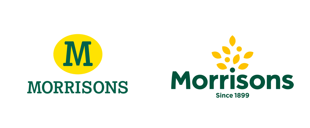
Another brand ‘off their tree’ as of late is WM Morrisons:

The supermarket chain has decided to drop the iconic M in favour of a tree, which in the words of their CEO David Potts, is ‘more confident’ and ‘feels more British’.
One may argue that like the tree, Morrisons leaves will branch out, feeding the people of the nation, with its roots firmly embedded in Great Britain, and has since 1899.
This explanation would be the marketers’ answer, perhaps even an ideological lean towards sustainability. Either way, the brand has made one catastrophic error.
By emphasising the date of the chain’s conception in its tagline, it’s clear they are celebrating their heritage.
To do so by completely removing the ‘M’ icon Morrisons has become recognised with over time, is in itself contradictory and counterproductive.
While I agree it was in dire need of updating for relevance in the marketplace, I think it was an error to abandon a stand-alone marque.
When the M stood alone, a high street consumer would instantly recognise it as Morrisons.
The new tree couldn’t be used alone.
It struggles when scaled down and the signage has a lot going on with the repetition on its recent applications to storefronts.
Taking the name of the company away, the leaves are not memorable enough, and there is too much going on for the marque to be truly remembered, the golden rule of branding springs to mind… ‘keep it simple’.

The Morrisons and Hed Kandi rebrands are great examples of style over substance.
In the case of Morrisons, the original symbol was an archetypal M.
Not only did the marque work practically across countless platforms, but the symbol has powerful roots in the esoteric.
The yellow circle symbolised the masculine sun, the source of all life and the ‘M’ the breasts from which mammals feed, a well-known fact behind the success of McDonald’s golden arches.
In other terms, the M subconsciously refers to the feminine form and the source of nourishment, which works perfectly for a food brand.
So that leads to the question of why start again when you can evolve?
In the case of Morrisons, I believe a brand evolution would have sufficed to bring it up to date and appeal to its target audience.
Perhaps the brand is a little too focused on its ‘what’ than its ‘why’.
While having 40 types of bread in-store is excellent, this is not what uniquely makes Morrisons.
There was a great opportunity here to reinvigorate the brand in the hearts and minds of the British populace by celebrating its heritage and story in an authentic and emotionally engaging way with a heritage campaign preceding the other adverts.

Excellent Heritage examples include the Hovis ‘Go On Lad’, Lloyds TSB ‘By your side‘ and Stella Artois ‘Sebastian Artois‘ ad campaigns.
What about the enriching and inspiring life story of Mr William Murdoch Morrison, who started selling eggs and butter in 1899.
Like the symbolic ‘M’ has he been lost to history too?
The recent ‘tradition’ ad campaign is unimaginative, cliché and fails to do the rebrand justice if you are celebrating heritage fantastic, so why not keep it real?
Imagine an advertising campaign that brings the founder to life through time to the present day, best communicating the brand purpose, how one mans actions positively affect the world today.
Did you know the Hovis ‘Go On Lad’ ad campaign resulted in sales going up by 12 million in three weeks, countless radio and press features, dozens of awards and in 2009 it was voted by the British public as the best television commercial of the decade?
In the following month, their share of the bread market increased by 3.5%, adding 60 million to its top line.
Authentic brand stories matter
What’s clear by these choices of rebrands is that ideology has sadly overtaken the need for a universally iconic symbol.
A brand mark is something that’s given meaning through experience, not necessarily something that has to be visualised within the brand design.
Where subliminal references work well in design, the values are something that is communicated through a great experience and is thus remembered and later referred to through the use of the brand symbol.
What seems to be the issue is the concept of branding has been bestowed upon a group of individuals who do not always fully understand or appreciate the mechanics of this ancient art form.
It seems the very foundations upon which iconic brands get built are being abandoned in favour of trends.
As history has proven, brands have become victims of egotistic design trends and throw away fads.
The concepts themselves have been reduced to audience segmentation and quantitative data, attempting to appeal to new hip audiences as a result of search results, opinion polls and social media behaviour.
Ultimately, what has empowered leading brands to thrive is a mixture of human perception and psychology.
By creating a positive customer experience and a memorable symbol, they have enjoyed and will continue to enjoy the recipe of success for many more years to come.


