
These eight significant companies all had a particular story for why they chose their colours.
Here they are …
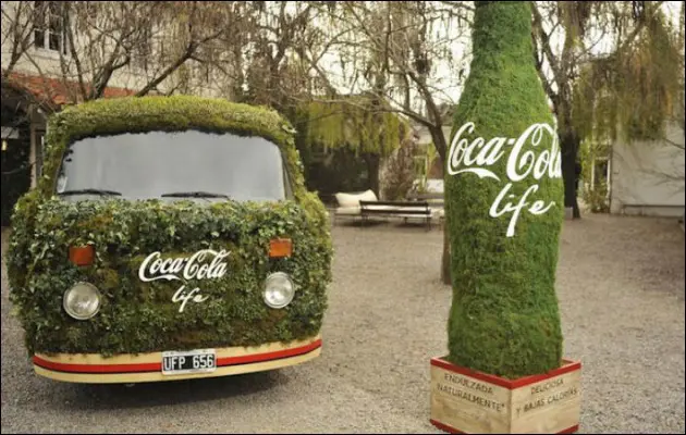
THE RED IN COCA-COLA BRANDING
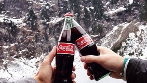
The famous Coca-Cola bottle got its colour right before 1900.
Tax officials used to check the contents of their trucks while they were distributing the soft drink.
To make it easier for them to distinguish alcohol from Coca-Cola, the soft drink bottles were branded a striking red colour.
And the reason they made the colour of their new ‘Life’ brand green is to portray good health.
THE PINK BRANDING OF THE FT
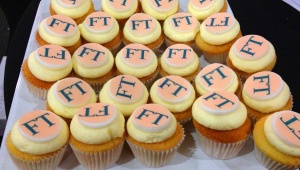
At about the same year as Coca-Cola, The Financial Times changed the colour of their paper.
To stand out against the significant competitor providing financial news called The City magazine in 1893, so they changed their colour to pink.
THE RAINBOW COLOURS OF GOOGLE
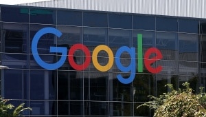
To make Google seem more playful, many different colours got experimented with.
When the logo was complete, it materialised into primary colours.
The graphic designer who was working on it – Ruth Kedar – told Wired Magazine that the green L got chosen last to add a different colour.
The idea was that “Google does not follow the rules.”
THE BLUE-WHITE BMW LOGO

Many people think that the BMW logo got designed to look like the white propeller of an aircraft at full-speed spinning through the clear blue skies.
But the colours have nothing to do with a rotating propeller.
It’s a myth!
The design and colours of the logo are a copy of the colours of Bavaria, where BMW is located.
THE BLUE BRANDING OF FACEBOOK

Facebook does not owe the company colour to any sorts of new studies or comparisons.
The colour of the social network created in 2004 got branded thanks to the eye disorder of founder Mark Zuckerberg.
The CEO is colour-blind to red and green.
Zuckerberg told The New Yorker that blue is the most vibrant colour for him. He can see all of blue.
THE RED AND YELLOW BRANDING OF SHELL
![]()
When Shell chose the current logo in 1915, of course, it also wanted to stand out among its competitors.
However, the colours yellow and red got chosen because the company had strong ties with Spain – and the Spanish flag has these colours.
THE CHIC-BROWN UPS LOGO
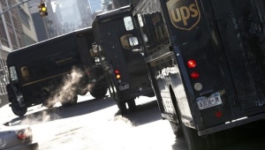
The colour brown can sometimes be associated with somewhat grim things, like peeling off wall-paper to see the painting from several decades ago that has gone brown.
When UPS chose the colour of their trucks for the delivery company, that was certainly not the case.
In 1916 it was the colour of luxury and class according to the former Vice President of Advertising and Public Relations.
THE PURPLE LOGO OF YAHOO
![]()
There are two stories behind the purple colour of search engine Yahoo.
According to Fast Company, David Filo co-founder of Yahoo, went to the local home improvement retailer in 1995 to pick new colours for the office.
A considerable amount of purple paint was on offer, enough to paint the entire company office purple.
The other story is that he bought grey paint that day, but the fluorescent lamps in the Yahoo office made it look like it was purple.
Source: Business Insider.

